
 |
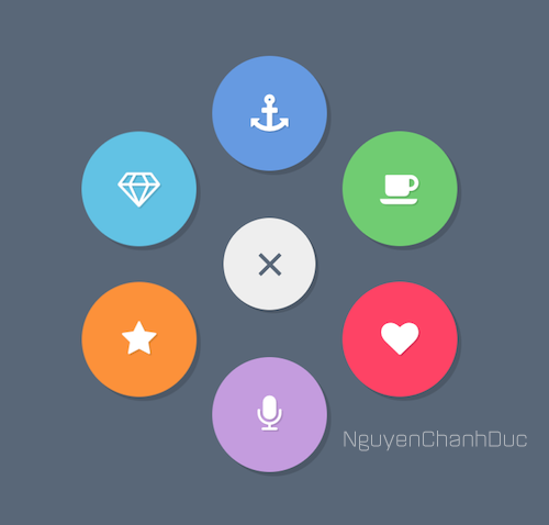
| Ảnh Demo. |
Lời đầu.
Xin chào, tôi là Nguyễn Chánh Đức, Admin của cái Blog này. Cũng khá lâu rồi, cụ thể đã là 4 tháng, tôi không đăng bài, blog ngưng hoạt động. Nhưng sau đó có những lời động lực của mấy người đàn anh, nên tôi quyết định sẽ viết bài và tiếp tục hoạt động trên blog này. Mong các bạn, các đối tác đàn anh đi trước sẽ luôn ủng hộ tôi. Những người luôn cho tôi động lực này chính là những người đàn anh đi trước, cụ thể ra đó là anh Quốc Bảo (Admin Quốc Bảo Blog), Lê Tuấn Anh (Admin Star Cường IT), Hưng Star (Admin Hưng Star-IT), Nguyễn Trọng Khanh (Admin Khanh Blogger), Tạ Thiên Quốc (Star Quốc Blog) và Niệm Style (Phan Văn Niệm). Cùng với 2 người bạn với tôi chính là Nguyễn Minh Quân (Admin Prince Design Blog), Trần Thái Tính (Admin Tính Getter Blog). Cảm ơn những đối tác đã ủng hộ và có những lời động lực đến tôi.
Sau đây, tôi xin chia sẻ tới các độc giả bài viết này. Mời các bạn tham khảo.
Demo
Demo
Cách làm:
Bước 1: Các bạn chèn (cài đặt) font awesome vào blog. Bằng cách thêm dòng này:
<link rel='stylesheet prefetch' href='https://netdna.bootstrapcdn.com/font-awesome/5.0.6/css/font-awesome.css'>
Bước 2: Các bạn thêm CSS này vào trước thẻ b:skin :
Bước 3: Các bạn thêm cái HTML này vào nơi muốn chèn là sẽ có cái menu như trên Demo
.menu-item, .menu-open-button { background: #EEEEEE; border-radius: 100%; width: 80px; height: 80px; margin-left: -40px; position: absolute; color: #FFFFFF; text-align: center; line-height: 80px; -webkit-transform: translate3d(0, 0, 0); transform: translate3d(0, 0, 0); -webkit-transition: -webkit-transform ease-out 200ms; transition: -webkit-transform ease-out 200ms; transition: transform ease-out 200ms; transition: transform ease-out 200ms, -webkit-transform ease-out 200ms; } .menu-open { display: none; } .lines { width: 25px; height: 3px; background: #596778; display: block; position: absolute; top: 50%; left: 50%; margin-left: -12.5px; margin-top: -1.5px; -webkit-transition: -webkit-transform 200ms; transition: -webkit-transform 200ms; transition: transform 200ms; transition: transform 200ms, -webkit-transform 200ms; } .line-1 { -webkit-transform: translate3d(0, -8px, 0); transform: translate3d(0, -8px, 0); } .line-2 { -webkit-transform: translate3d(0, 0, 0); transform: translate3d(0, 0, 0); } .line-3 { -webkit-transform: translate3d(0, 8px, 0); transform: translate3d(0, 8px, 0); } .menu-open:checked + .menu-open-button .line-1 { -webkit-transform: translate3d(0, 0, 0) rotate(45deg); transform: translate3d(0, 0, 0) rotate(45deg); } .menu-open:checked + .menu-open-button .line-2 { -webkit-transform: translate3d(0, 0, 0) scale(0.1, 1); transform: translate3d(0, 0, 0) scale(0.1, 1); } .menu-open:checked + .menu-open-button .line-3 { -webkit-transform: translate3d(0, 0, 0) rotate(-45deg); transform: translate3d(0, 0, 0) rotate(-45deg); } .menu { margin: auto; position: absolute; top: 0; bottom: 0; left: 0; right: 0; width: 80px; height: 80px; text-align: center; box-sizing: border-box; font-size: 26px; } .menu-item:hover { background: #EEEEEE; color: #3290B1; } .menu-item:nth-child(3) { -webkit-transition-duration: 180ms; transition-duration: 180ms; } .menu-item:nth-child(4) { -webkit-transition-duration: 180ms; transition-duration: 180ms; } .menu-item:nth-child(5) { -webkit-transition-duration: 180ms; transition-duration: 180ms; } .menu-item:nth-child(6) { -webkit-transition-duration: 180ms; transition-duration: 180ms; } .menu-item:nth-child(7) { -webkit-transition-duration: 180ms; transition-duration: 180ms; } .menu-item:nth-child(8) { -webkit-transition-duration: 180ms; transition-duration: 180ms; } .menu-item:nth-child(9) { -webkit-transition-duration: 180ms; transition-duration: 180ms; } .menu-open-button { z-index: 2; -webkit-transition-timing-function: cubic-bezier(0.175, 0.885, 0.32, 1.275); transition-timing-function: cubic-bezier(0.175, 0.885, 0.32, 1.275); -webkit-transition-duration: 400ms; transition-duration: 400ms; -webkit-transform: scale(1.1, 1.1) translate3d(0, 0, 0); transform: scale(1.1, 1.1) translate3d(0, 0, 0); cursor: pointer; box-shadow: 3px 3px 0 0 rgba(0, 0, 0, 0.14); } .menu-open-button:hover { -webkit-transform: scale(1.2, 1.2) translate3d(0, 0, 0); transform: scale(1.2, 1.2) translate3d(0, 0, 0); } .menu-open:checked + .menu-open-button { -webkit-transition-timing-function: linear; transition-timing-function: linear; -webkit-transition-duration: 200ms; transition-duration: 200ms; -webkit-transform: scale(0.8, 0.8) translate3d(0, 0, 0); transform: scale(0.8, 0.8) translate3d(0, 0, 0); } .menu-open:checked ~ .menu-item { -webkit-transition-timing-function: cubic-bezier(0.935, 0, 0.34, 1.33); transition-timing-function: cubic-bezier(0.935, 0, 0.34, 1.33); } .menu-open:checked ~ .menu-item:nth-child(3) { transition-duration: 180ms; -webkit-transition-duration: 180ms; -webkit-transform: translate3d(0.08361px, -104.99997px, 0); transform: translate3d(0.08361px, -104.99997px, 0); } .menu-open:checked ~ .menu-item:nth-child(4) { transition-duration: 280ms; -webkit-transition-duration: 280ms; -webkit-transform: translate3d(90.9466px, -52.47586px, 0); transform: translate3d(90.9466px, -52.47586px, 0); } .menu-open:checked ~ .menu-item:nth-child(5) { transition-duration: 380ms; -webkit-transition-duration: 380ms; -webkit-transform: translate3d(90.9466px, 52.47586px, 0); transform: translate3d(90.9466px, 52.47586px, 0); } .menu-open:checked ~ .menu-item:nth-child(6) { transition-duration: 480ms; -webkit-transition-duration: 480ms; -webkit-transform: translate3d(0.08361px, 104.99997px, 0); transform: translate3d(0.08361px, 104.99997px, 0); } .menu-open:checked ~ .menu-item:nth-child(7) { transition-duration: 580ms; -webkit-transition-duration: 580ms; -webkit-transform: translate3d(-90.86291px, 52.62064px, 0); transform: translate3d(-90.86291px, 52.62064px, 0); } .menu-open:checked ~ .menu-item:nth-child(8) { transition-duration: 680ms; -webkit-transition-duration: 680ms; -webkit-transform: translate3d(-91.03006px, -52.33095px, 0); transform: translate3d(-91.03006px, -52.33095px, 0); } .menu-open:checked ~ .menu-item:nth-child(9) { transition-duration: 780ms; -webkit-transition-duration: 780ms; -webkit-transform: translate3d(-0.25084px, -104.9997px, 0); transform: translate3d(-0.25084px, -104.9997px, 0); } .item-1 { background-color: #669AE1; box-shadow: 3px 3px 0 0 rgba(0, 0, 0, 0.14); text-shadow: 1px 1px 0 rgba(0, 0, 0, 0.12); } .item-1:hover { color: #669AE1; text-shadow: none; } .item-2 { background-color: #70CC72; box-shadow: 3px 3px 0 0 rgba(0, 0, 0, 0.14); text-shadow: 1px 1px 0 rgba(0, 0, 0, 0.12); } .item-2:hover { color: #70CC72; text-shadow: none; } .item-3 { background-color: #FE4365; box-shadow: 3px 3px 0 0 rgba(0, 0, 0, 0.14); text-shadow: 1px 1px 0 rgba(0, 0, 0, 0.12); } .item-3:hover { color: #FE4365; text-shadow: none; } .item-4 { background-color: #C49CDE; box-shadow: 3px 3px 0 0 rgba(0, 0, 0, 0.14); text-shadow: 1px 1px 0 rgba(0, 0, 0, 0.12); } .item-4:hover { color: #C49CDE; text-shadow: none; } .item-5 { background-color: #FC913A; box-shadow: 3px 3px 0 0 rgba(0, 0, 0, 0.14); text-shadow: 1px 1px 0 rgba(0, 0, 0, 0.12); } .item-5:hover { color: #FC913A; text-shadow: none; } .item-6 { background-color: #62C2E4; box-shadow: 3px 3px 0 0 rgba(0, 0, 0, 0.14); text-shadow: 1px 1px 0 rgba(0, 0, 0, 0.12); } .item-6:hover { color: #62C2E4; text-shadow: none; }
<nav class="menu"> <input type="checkbox" href="#" class="menu-open" name="menu-open" id="menu-open" /> <label class="menu-open-button" for="menu-open"> <span class="lines line-1"></span> <span class="lines line-2"> </span> <span class="lines line-3"></span> </label> <a href="#" class="menu-item item-1"> <i class="fa fa-anchor"></i> </a> <a href="#" class="menu-item item-2"> <i class="fa fa-coffee"></i> </a> <a href="#" class="menu-item item-3"> <i class="fa fa-heart"></i> </a> <a href="#" class="menu-item item-4"> <i class="fa fa-microphone"></i> </a> <a href="#" class="menu-item item-5"> <i class="fa fa-star"></i> </a> <a href="#" class="menu-item item-6"> <i class="fa fa-diamond"></i> </a> </nav>
Lời kết
Bài viết tới đây là đã hết rồi, tôi xin cảm ơn tất cả các bạn và độc giả đã ủng hộ tôi, quan tâm tôi trong suốt thời gian qua. Xin thông báo lại: Star Đức Blog đã hoạt động lại như trước. Mọi người cố gắng ủng hộ nhé.
Code: Thuthuatweb

